Friday, 10 June 2011

Graded Unit 2 'Pier 39'

My Research and Inspiration for a new themed restaurant to be situated on the South pier at Kirkcaldy harbour.


Aerial Views of the harbour at Kirkcaldy showing the South pier with the existing old building.
It is shaped similar to a number 9.


This is a large capstan situated on the harbour and it inspired my idea of a revolving restaurant.

Steps leading up to the pier-there are 39!
This lead me to research the novel 'The 39 Steps' by John Buchan-he grew up in Kirkcaldy therefore it felt relevant to use this as a reference.


'The 39 Steps' by John Buchan


John Buchan aged 7 approx.


Design Solution

I used the numbers '39' to plan out the floor plan designs.


A sketch of how I envisaged the building from the harbour and also a view from the sea.


CAD Vectorworks model of 3 levels in restaurant.
Presentation Boards

Inspiration board


Ground floor plan and layout


First floor plan and layout


Revolving restaurant on Second Floor


Lighting plans for all 3 levels


First floor booth seating all around the window to maximise views over the River Forth.


First floor plan layout showing booth window seating and also private dining booths with neon atmospheric lighting.


Revolving restaurant on the Second Floor.


Yas Hotel-Abu Dhabi Designed by Asymptote Architecture New York
This building inspired my design for the new roof structure for my restaurant-it is made of metal with glass, and it had LED lighting inserted inside which creates a unique lighting experience. I gave the LED lighting a miss-didn't think Kirkcaldy harbour could take it.


'Working with a client'

I was asked to design a modular Educational Exhibition on 'The Energy Cycle'. I researched the various energy sources and decided to place them inside 'pods'. Each pod would represent an energy source and different interactives would be placed within the pod and also around it.


Sketch ideas for the different 'Energy sources'

CAD image of the pods situated in Exhibition Space.


New Plans for Biomass Visitor Centre for Tullis Russell-TREE
Tullis Russell Educational Environmental Centre.


Plans for the Biomass Visitor Centre Markinch
Initial sketch ideas for floor layout for new Bio-mass Visitor Centre in Markinch.


The new biomass Centre has been introduced  to celebrate the 200th Anniversary of Tullis Russell paper making plant..  They joined forces with the local Community Council and together they are funding the new building which is due for completion in Sep/Oct 2011.  


These sketches of floor plans show a birds eye view of the three interactive screens shaped as branch/tree forms. This enables the use of the space to be maximised in the centre as the wall space is limited with the addition of doorways and windows.


This is a sketch drawing of the Cafe/Picnic area. We all agreed that an area where the visiting schools and members of the public would benefit from having a seating area where they could meet or just chill out whilst their children explore the interactives. It also gives the opportunity for them to eat their packed lunches.


This is the outdoor Forestry section which also provides the opportunity for seating and a collective meeting area.
This section also has interactives and information relating to forestry issues.


Friday, 11 February 2011

80:20 Shoe Shop Design

Floor plan layout created using Vectorworks CAD. This view shows tree position outside with natural sunlight creating interesting visuals in the interior space


View from the back left corner looking towards shop entrance. The layered ceiling inspired by images of the Grand Canyon


                                     View of  ladies department from back right corner of shop


Mens department back wall


Front window display showing clear glass ball shapes suspended from the ceiling and displaying new stock fashion shoes and accessories


Shop window dispaly capturing the essence of an evening


my sketch drawing of the new shop logo for the signage. The two companies merging are 'Schuh' and 'Red or Dead' and I thought the 3 circles symbolises the 2 companies merging together


                          Finished logo created on Photoshop using my initial sketches as reference


View on approach to shop featuring 'Shoe Tree'


INSPIRATION


Shoe tree in Fallon Neveda


                                                               Grand Canyon


                                                            Looking Glass Rock-Utah


                COMEDY CLUB PROJECT


Memory Box
I added some sketches of my designs and some inspirational comedians from my childhood into a box.  I built this from a sheet of acrylic. I had to cut it into 30cm square pieces and glue them together, I then added printout images on acetate sheets and stuck them to the inside.  These could be used as a light box.


Images of the interior ideas for Comedy Club.


I loved drawing this harlequin, using different B sketch pencils


I had a project to design a new Comedy Club within an exsisting theatre space. I researched various comedy clubs and I looked into what comedy meant to me and what made me laugh.  I was brought up with comedy being very prominent in my household. My dad loved Laurel and Hardy and Steptoe and son, Abbott and Castello.

I decided that this would be my inspiration and I looked into Charlie Chaplin era. It was Chaplin that paved the way for the slapstick comedy outburst. He was a descendant from the Harlequin period and this gave me the idea for interior space design.


This is the sculpture I designed using Vectorworks. It is designed to hang suspended in the extended entrance.


Saturday, 29 January 2011

My Corporate Identity Journey


I didn't know where to start so just drew 1st ideas that came to mind.  I preferred the lower cased lettering from the very start, and also soft organic like textures and shapes. 


This led on very nicely to my drawing of a tree which I copied onto photoshop and mirrored before joining them up, this gave a heart like shape design in the centre which made me very happy as I love my hearts!!!  I also had to choose a font which gave the effect of my initials b and f creating a shadow as I liked this in my initial sketches.


I wanted to make my initials and the word DESIGN as though they were falling from the tree, and I added a black circle to strengthen the trees image and reversed that section to create an interesting eye catching effect. I then replaced  the dot of the letter I, for a love heart (to represent my love for design)


My final design has another circle in top of the tree but I made this opaque to add a bit of mystery and the three images together represent INTERIORS*ART*DESIGN as I love all three.


Wednesday, 27 October 2010

My personal investigation

I am doing a project at college in my chosen area of interior design. I am researching the history of architecture in the Baroque period and how it influenced modern day styles within the design industry, It is very flambouant and extravagant with lots of elegance and I feel it has strong feminine characteristics but at the same time it has stature and presence and a figure of beauty that is the essence of the surroundings of the place you are in whether its London, Rome, Barcalona, Paris....... the buildings make the place! Who could go to these places and not be inspired or at least be in awe.

I suppose I am a romantic and am totally swept away by the scale of these iconic buildings, and cant help but wonder at all the years before we were here, these were being designed and built by talented craftsmen. No computers and fancy machinery in sight!!!


The Baroque style appeals to me and I've decided to research on this chosen period. This is St Peters Basilica Rome by Michelangelo.


This is St Pauls Cathedral London by Sir Chritopher Wren. Such a beautiful building and a great achievement for a scientist/astronomer/mathematic genius but not a trained architect!


                                     This baroque period style of writing is very artistic and ornate.


Wednesday, 13 October 2010

designs for floor plans and interiors for my Castle

my kitchen and piano room design for my Dream Home Castle. Both in pastels.


This is the ground floor plans, which I included a swimming pool to the rear of the property.


I designed the shape of the pool from my drawing of an abstract thistle shape which I thought was a subtle way of incorporating a scottish element without it looking too obvious.
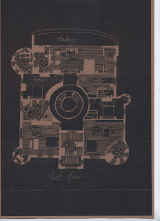


This is the first floor plan showing the bedrooms all leading off central staircase and hallway.  The master bedroom has a balcony overlooking beautiful gardens.


This would be my dream location, on the banks of lock Awe or similar. I drew building then kept it obviously out of perspective and added it to the landscape.


My inspiration board for my dream home which shows my love for family life mixed with beautiful scottish scenery and nature. This together with being by the water makes the perfect combination for a peaceful, inspirational, ever changing environment for happy living.